OK Liquor, Zimbabwe
Scope of Works: Brand Design, Interior Design, Technical Documentation
Tasked with rebranding the Zimbabwean OK Liquor store, our mission was to infuse it with a distinct personality while maintaining its association with the OK stable. Our approach centered on creating a unique identity for the liquor store while leveraging the new OK logo, ensuring cohesion within the brand family.
Our goal was to give the liquor store its own identity within the OK brand umbrella. We aimed to evoke a sense of joy and happiness through every brand touchpoint, reflecting the essence of "Cheers to Happiness."

Distinct Personality
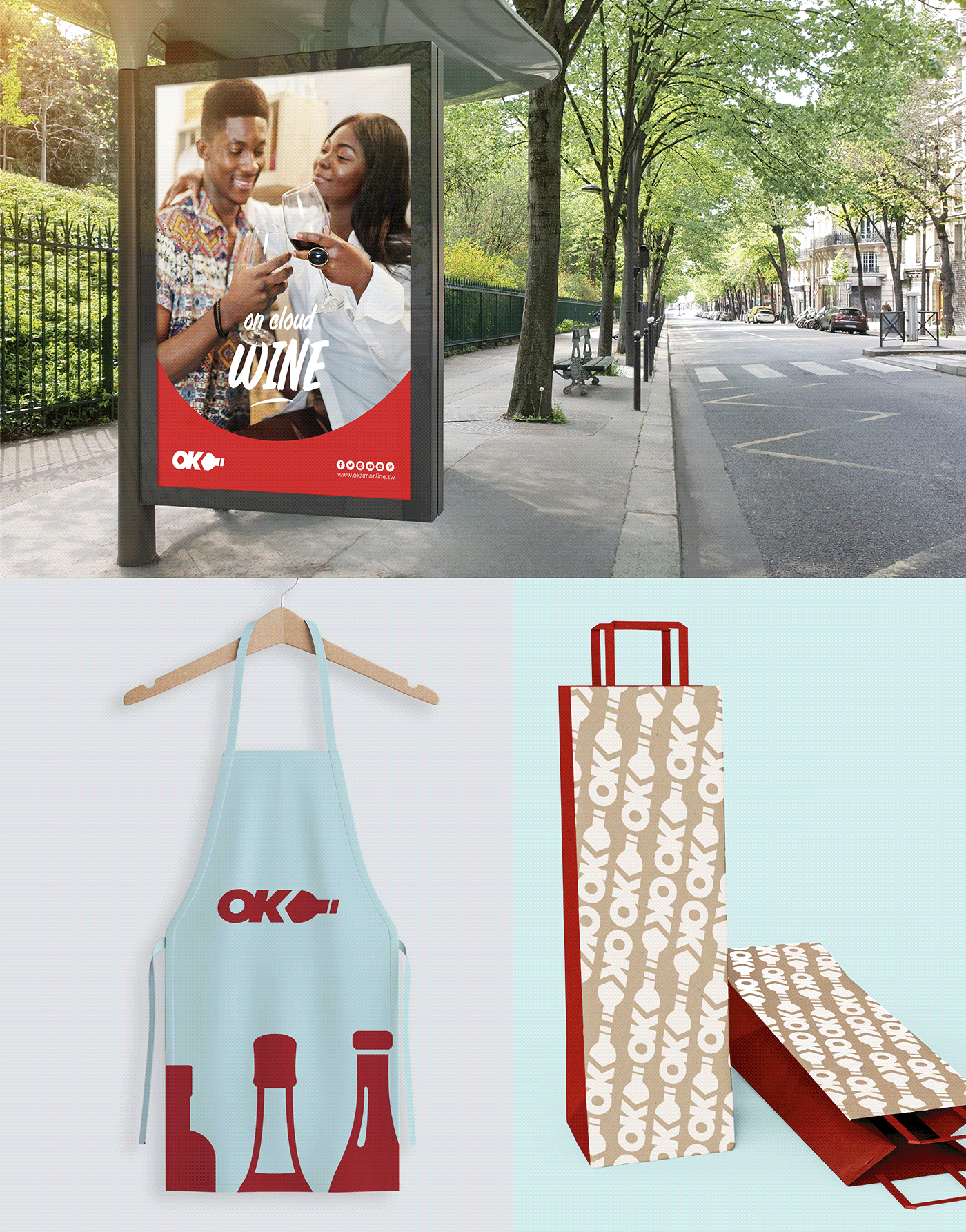
We developed a unique personality for Ok Liquor, encapsulating the spirit of celebration and joy. The use of the OK logo as a wine bottle conveys the store's identity while maintaining ties to the OK brand.
"Cheers to Happiness"
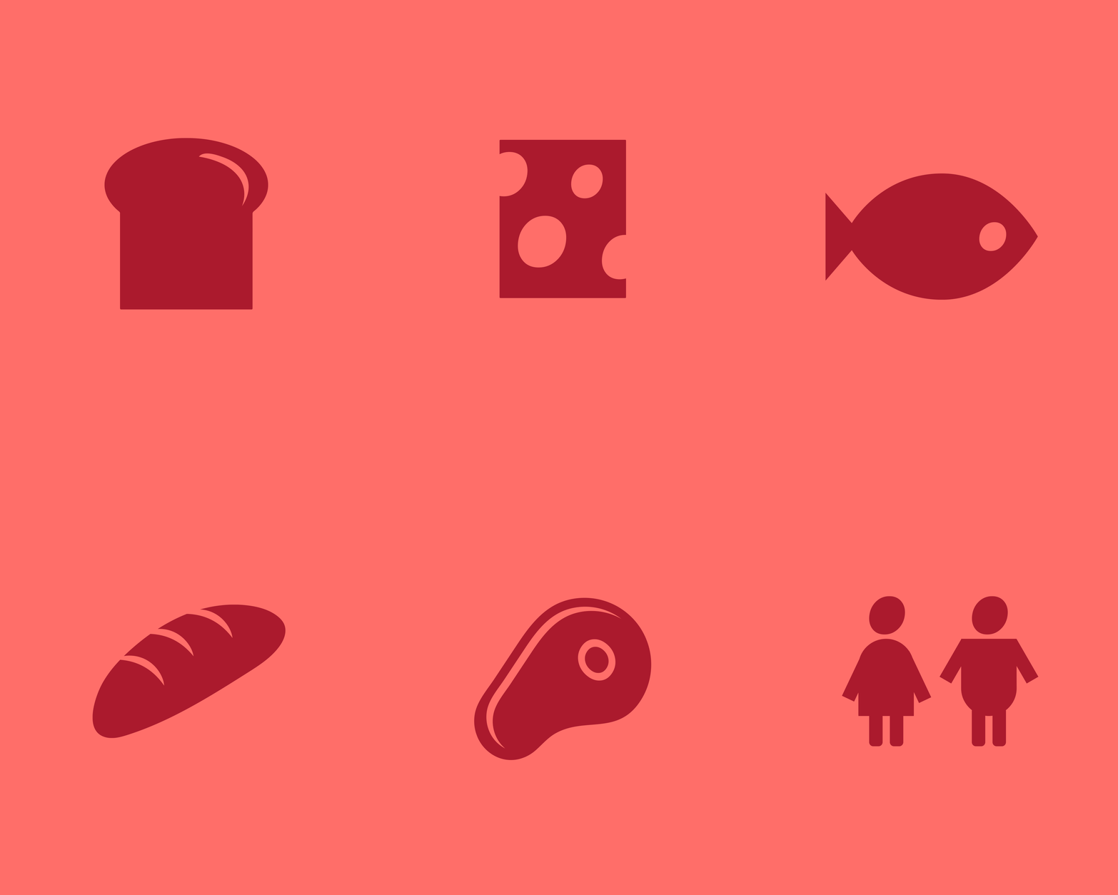
This mood became the guiding principle for the brand, influencing everything from visual elements to tone of voice. We aimed to bring smiles to people's faces through fun patterns, custom liquor iconography, and a playful tone.
Hero Colors
Red and dark maroon, synonymous with the OK brand, were retained as hero colors. We introduced ice blue to differentiate the liquor store's brand identity while complementing the existing color palette.

Logo Design
The OK logo transformed into a wine bottle serves as the centerpiece of the brand identity. It can stand alone or be accompanied by the word "Liquor" beneath, ensuring clarity and recognition.
Visual Elements
Fun patterns and custom liquor iconography infuse vibrancy and personality into the brand. These elements, combined with the hero colors, create a cohesive and engaging visual language.
Tone of Voice
A fun and playful tone of voice resonates across all brand communications, reinforcing the message of "Cheers to Happiness" and creating memorable interactions with customers.


The rebranded OK Liquor store exudes a distinct personality while maintaining alignment with the OK brand family. "Cheers to Happiness" serves as the driving force behind every aspect of the brand, from its visual identity to its tone of voice. With the incorporation of fun patterns, custom iconography, and a playful color palette, OK Liquor emerges as a destination that not only offers quality liquor but also spreads joy and celebration to its customers.


Maintaining consistency with the OK store's basic uniform ensures seamless movement for staff between stores. The basic kit comprises golf T-shirts, skirts, jeans, and retro bomber jackets, providing comfort and versatility for employees.
The OK Liquor uniform strikes a perfect balance between consistency and individuality.
By retaining the basic elements of the OK store uniform and incorporating subtle customizations, staff can seamlessly transition between stores while still embodying the unique personality of OK Liquor. The addition of the full-length apron as the hero item adds a touch of sophistication and fun to the ensemble, further enhancing the brand's identity and creating a memorable experience for customers.


